Custom Tiles in C#Bot
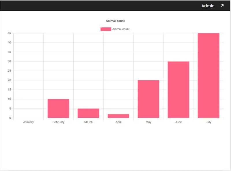
This article will explore how to add custom code into a tile. Adding custom tiles to your application is easy for when you require more fine grain control over your UI elements. For this project, we will be using the Codebots Zoo Project to demonstrate this feature. We’ll add a new chart that will display a simple graph of animal counts from January to July . You can follow along with the project by downloading the latest Zoo Sharp version from the public git page.
User Story: As an Admin, I want to display a chart of the number of animals in the Codebots Zoo, so that I know if I need more enclosures or Keepers.
You will be required to interact with the following files to complete this task:
| File Name | Description |
|---|---|
| ChartTile.tsx | TypeScript file where we define our new chart with graphs and related functionality |
It might be surprising to you but all Chart* files do not exist in the clientside project! This is because we have not added our new chart tile. This will be our first order of business.
Adding Graphs
Here we will use ChartJS and React Wrapper react-chartjs-2 for charts and graphs. This should be added as a react dependencies.
The current version of C#Bot will remove any new libraries if the project is re-built using the Build section of the platform. The next version of C#Bot will resolve this issue. You will still be able to follow this example, as it does not require re-building.
To install ChartJS:
-
Open a terminal and navigate to
clientsideand run to install the dependenciesyarn add --save react-chartjs-2 chart.js yarn add --save-dev @types/react-chartjs-2@types/react-chartjs-2is a type definition file for TypeScriptNow that we have added everything we need, we can add and display our graph in our tile.
-
Locate
clientside\src\Views\Tiles\ChartTile.tsxand insert the following code into the protected regions.Remember to turn on the protected regions
 // % protected region % [Add any extra imports here] on begin
 import {Bar} from 'react-chartjs-2';
 // % protected region % [Add any extra imports here] end
// % protected region % [Override contents here] on begin return <Bar data={{ labels: ['January', 'February', 'March', 'April', 'May', 'June', 'July'], datasets: [{ label: 'Animal count', backgroundColor: 'rgb(255, 99, 132)', borderColor: 'rgb(255, 99, 132)', data: [0, 10, 5, 2, 20, 30, 45] }] }} // Configuration options go here options={{ title: { text: 'Animal count', display: true }, scales: { xAxes: [{ display: true }], yAxes: [{ display: true }], } }} />; // % protected region % [Override contents here] end -
Once saved, visit this url, you should now see a chart that looks something like this:

Related Articles
Was this article helpful?